Wolf Creek
Analysis of 2 minutes –
The audience is automatically aware of the location of the film as within seconds kangaroos are shown through a mid-shot; it is instantly recognisable as being set in Australia. The lighting of the establishing shot is misleading as it is bright but not a cheery bright; no blue skies. It appears to be a dead heat with just the sun blazing, although this is positive it also strikes disbelief because the atmosphere portrays an eerie feeling. There is a brief moving shot of a woman running down a long distance path with diegetic sound of her panting. This creates the impression that it will be an action/drama film; possibly slight horror too.
There are no credits except a few production logos and the title sequence which is introduced on a dark screen in bright shaky lettering. The same type of text is followed after this with informative sentences on pitch black backgrounds. This is to highlight what the sentences are telling you to provoke a scare into the audience; as they read each one they become more inclined to watch the film because it is based on reality so are they not only hoping it will be a good scary movie, they are also being made aware of what has and could happen in real life. It is a convention of horror films to put this initial title slide. This effect shocks us into watching it, especially with the creepy non-diegetic sound in the background.
This follows into an empty long distance shot of a beach; also with the sun blazing but no bright skies. Diegetic sounds of the waves crashing and birds squawking are effectively used to create suspense and mystery. The scene is then switched to a two shot of two men speaking; at this moment what they are saying and who they are is currently unknown to the audience, however we are further brought to the attention that Australia is the location through the background of presumed outback and the men’s clothing (shorts, vests, sunglasses and hats.) The audience’s attention is then turned to a group shot of a few people sitting at a table looking through photos and laughing. A close up of one of the photo’s is shown which creates the impression that the person in that photo will have a significance to the unfolding of the story.
In the first 2 minutes very little action happens but the audience feel obliged to continued watching because of the shocking facts shown before any of the actual film began. It was effective to have the facts before anything happened because the audience would not have felt engaged enough to continue watching.
 |
| 1 |
1. This establishing shot provides the audience information so that they are aware that the setting of the film is Australia because of the kangaroos. The lighting on this particular screenshot creates an eerie atmosphere because it is bright but makes the area appear deserted which entails mystery.
 |
| 2 |
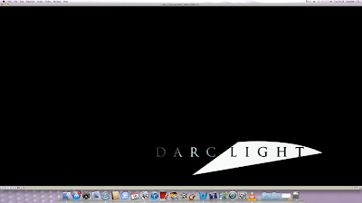
2. The simplicity of this logo is very catching because it is clever but not over the top; especially with the two most obvious contrasts.
 |
| 3 |
 |
| 3 |
 |
| 3 |
3. The composition of the text draws the audience’s attention in because it is right in the middle which emphasises its importance. The actual words in the sentence create a spine-chilling effect amongst the audience because it relates to reality making the story a lot more captivating to people watching.
 |
| 4 |
4. With the pitch black background and small white print, audience are positioned to feel like they should be paying attention and that the facts should grip their attention because of how blatant they are set out it highlights the seriousness.
 |
| 5 |
5. This long distance shot creates the scene for the rest of the story to follow. With the sun making the lighting of the scene bright it suggests that the following event will not be negative, however like the establishing shot, an eerie atmosphere envelops which creates an uncertainty amongst the audience.
No comments:
Post a Comment